ChatGPT, GeminiFigma, Claude DesignClaude Code, Vercel
overview
Missed the last train, over budget, alone at 1am in a city you don’t know
Warbler is a mobile companion for solo travellers in a moment of difficulty. It isn’t a booking app, an itinerary builder or a social network. Its guide, Woby, answers in plain language, offers a few options, and always leaves the final say with you.
who it’s forSolo travellersFirst-timers first, and anyone who ends up alone and uneasy.
what I madeA running iOS conceptOnboarding, five tabs, ten pushed screens and a guided tour, deployed live.
howResearch + AI toolsChatGPT and Gemini for research, Claude Design to shape it, Claude Code to build it.
The hard part of solo travel isn’t being alone. It’s the moment something goes wrong
I started with one question: why is travelling solo so uncomfortable? The answers grouped into eight kinds of friction, and most of them get worse when you’re on your own.
age67%of solo travellers are 18–30. Most are on an early trip, just like Mike.
top destination#1Thailand leads solo bookings (7.4%), ahead of Spain and Italy.
decides the trip51%choose a destination on cost first, so a budget view has to be in the app.
how they stay safeThe most common safety habit is telling someone where you are.That became Warbler’s trusted-contact check-in rather than a panic button.
Tell friends and family their location30%
Research places in advance25%
Avoid going out alone at night23%
Meet other travellers, stay in groups15%
persona
Mike, 22
Psychology student in London, celebrating his thesis with a first solo trip, to Thailand. Browses r/solotravel, saves TikToks of hostels, starts a budget spreadsheet and gives up halfway.
—Planning. Too many options and platforms, so he freezes.
—Budget. Unsure how to estimate costs across currencies.
—Anxiety. Nervous about getting around a non-English-speaking country.
—Self-doubt. Afraid of messing up something basic, like a visa.
“What I like most about travelling alone is the independence.”Anonymous, male, 28
“What makes it uncomfortable is knowing that if something goes wrong, I’m on my own.”Anonymous, female, 22
The clearest finding: people didn’t want more tools. They wanted support in the moment. That shifted the product away from a planning dashboard and towards a second opinion: something that helps you explore independently, while knowing you’re not completely on your own.
designing with ai
Three tools, three different jobs
Warbler began as a Figma concept for a designathon with my team, Design Soap. I then rebuilt it on my own with AI tools, which meant I could test behaviour as well as layouts: what Woby says when you’re offline, how the money number changes after you log a spend, where the tour spotlight lands.
1
ChatGPTGemini
Pressure-tested the premise and researched how existing solo-travel safety apps actually behave. They helped me find data, research the target audience and their pain points, and draft the persona and user flow.
2
Claude Design
Shaped the product and the interaction model. I brought a couple of Figma prototypes, and Claude Design scaled them up and tightened their fit with iOS guidelines. It also wrote Woby’s voice and standard responses.
3
Claude Code
Built the running app, which I deployed to Vercel from a GitHub repo.
where AI fell shortAI was fast, but it had no taste and no brakesEvery tool produced something that worked. My job was deciding what was right for a nervous traveller at 11pm, and cutting everything else.
1The first UI was bland
what ai didClaude Design’s first pass was clean and generic: grey cards, no character, nothing that felt like a companion.what I didPushed for colour as a status signal, real icons, motion, and Woby as a proper character with moods.
2Woby sounded too cheerful
what ai didEarly replies were upbeat in the wrong moments, with lots of exclamation marks and “Don’t worry!” when someone had lost their passport.what I didWrote tone rules: stay calm, name the problem, give one next step. No exclamation marks in anything urgent.
3Research stats without sources
what ai didChatGPT and Gemini gave confident numbers about solo travellers, and some had no source I could find.what I didKept only figures I could trace back, and leaned on real traveller quotes over statistics.
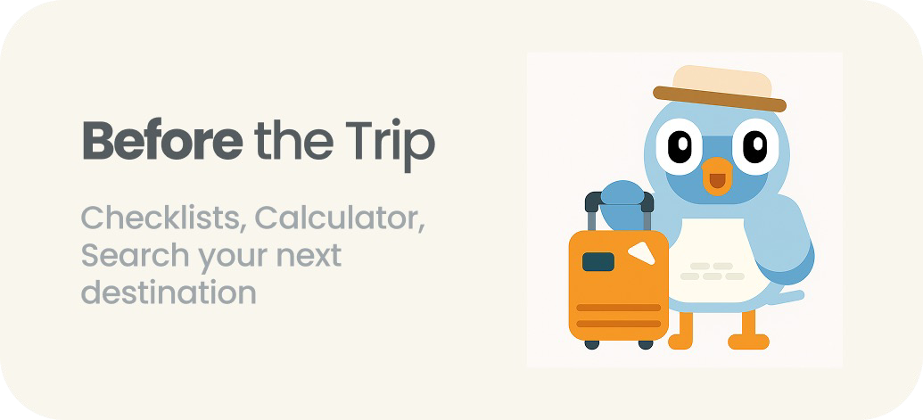
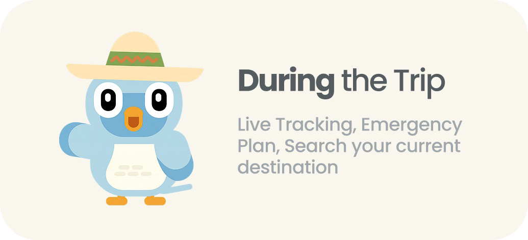
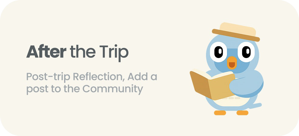
Before: a dashboard split by trip stage
After: one conversation, five tabs
decisions
Three forks that shaped the app
Going from the designathon concept to a working app meant making calls the first version never had to make.
1Organise by trip stage, or by the moment you’re in?
droppedA dashboard split into Before, During and After the trip
choseOne conversation with Woby, open on whatever is happening now
whyTravellers don’t think in stages when something goes wrong. Mike doesn’t want to work out which section a missed train belongs in; he wants to say it and get help.
the trade-offA chat is harder to browse. You can’t see everything at a glance, which is why the tabs came next.
2Chat only, or chat plus structure?
droppedA single chat screen that does everything
choseChat at the centre, with five tabs: Now, Plan, Nearby, Money and Support
whySome things need to be seen, not asked for: tonight’s plan, what’s left of the budget, emergency numbers. Burying them in chat history made them slower to reach.
the trade-offMore to navigate. I capped it at five, the iOS tab bar limit, and anything that didn’t earn a tab was cut.
3A panic button, or a calm check-in?
droppedA big red SOS button on the home screen
choseEmergency help in the Support tab, plus check-ins with a trusted contact
whyThe most common safety habit in the research was telling someone where you are, not calling for help. A red button on every screen also raised anxiety instead of lowering it.
the trade-offLess dramatic in a demo, and one more tap to reach emergency numbers. I kept them one tap away from the Support tab.
principles
Five rules, and each one is visible in the product
1Three things you could actually doEvery answer comes down to a few concrete options, never a wall of advice.
2You have the final sayNothing is booked, sent or shared without an explicit confirm. Location sharing ends by itself.
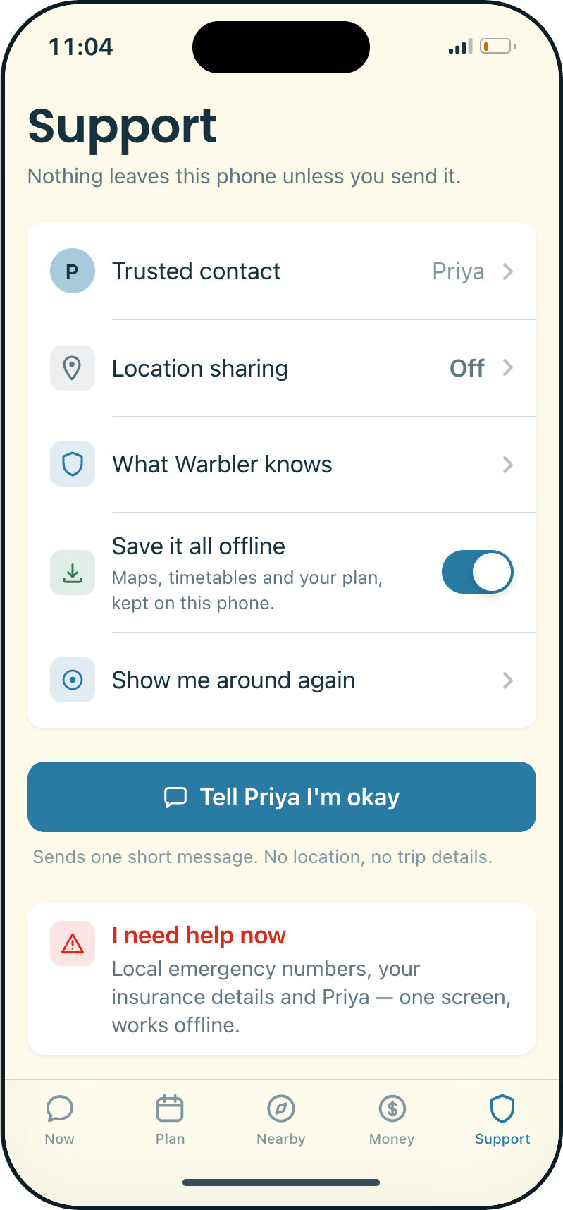
3It works when the phone doesn’tMaps, timetables and emergency numbers are saved on the phone. Offline answers are labelled as offline, not shown as errors.
4Never tell the user offMoney stays visible, not moralised. No guilt anywhere in the copy.
5Nothing leaves the phone unless you send itEvery data source can be switched off individually, and you can delete everything in one tap.
five tabs
Everything starts with telling Woby what happened
The help is local. Four cities are fully written (Osaka, Lisbon, Reykjavík and Seoul), each with its own emergency numbers, last-train times, transit card, pharmacy and traveller answers. Change the destination and every screen changes with it.
tab 01Now
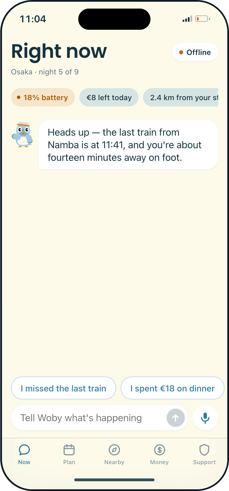
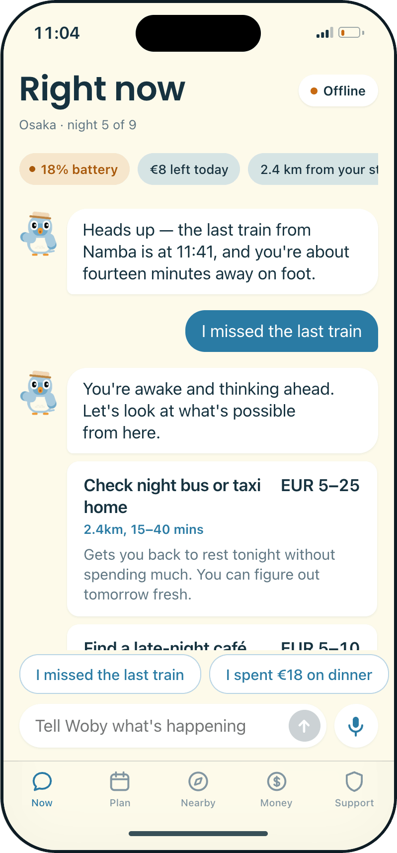
A conversation with Woby. You describe what happened in your own words and get options back, not a lecture. A strip at the top shows the context: night number, money left today, battery, distance from your stay.
tab 02Plan
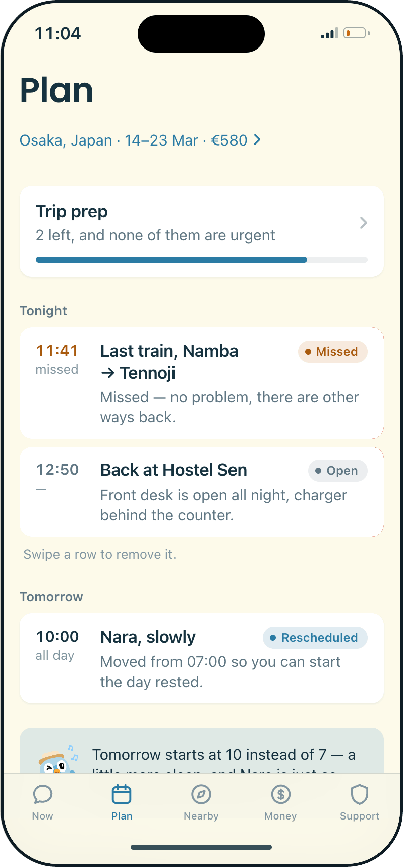
Tonight’s shape, not a schedule. Anything Woby adds is marked as Woby’s and can be swiped away. Trip prep lives here too.
tab 03Nearby
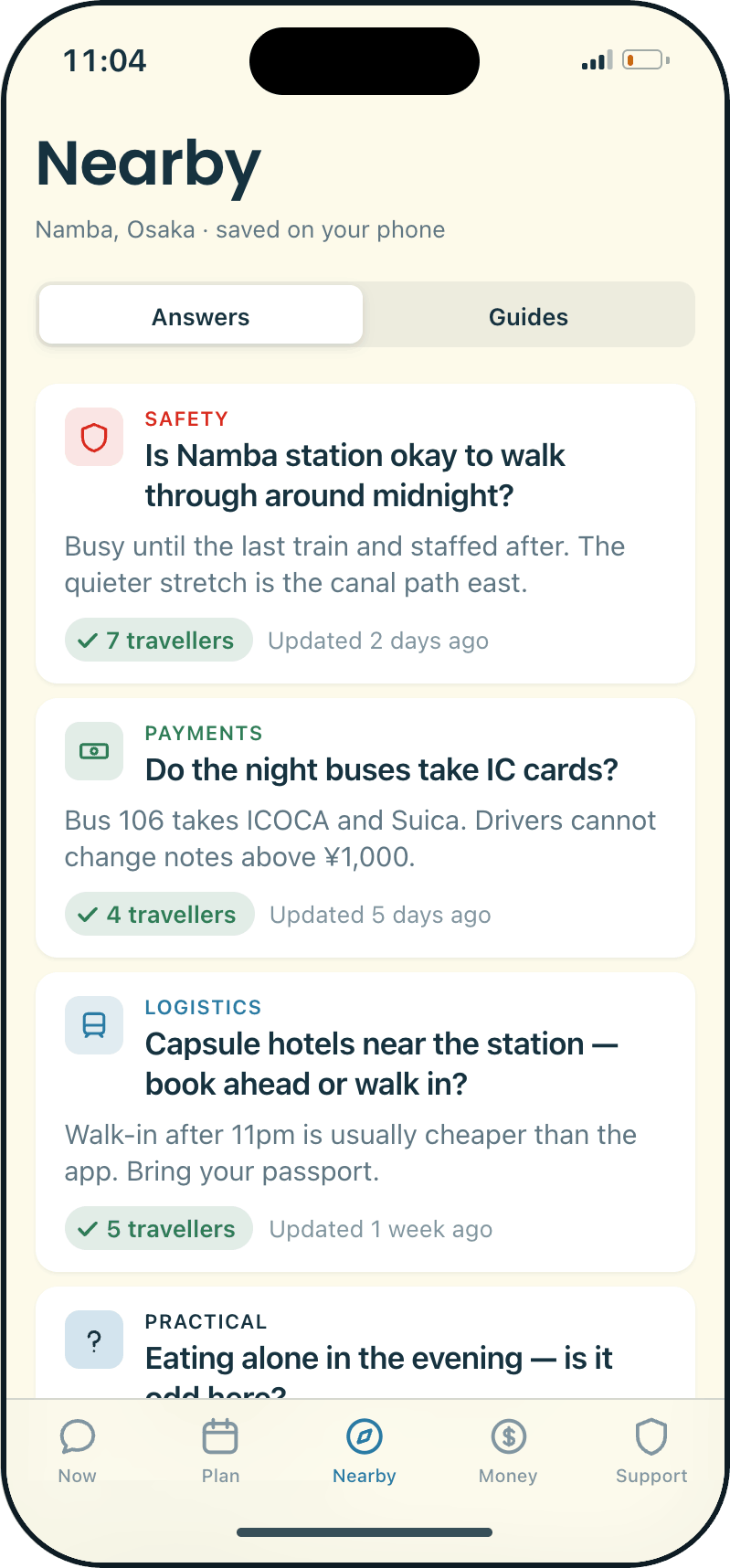
Answers from travellers who were in the city before you, saved to the phone. If nothing fits, you can ask anonymously. This replaced the social feed from the first version.
tab 04Money
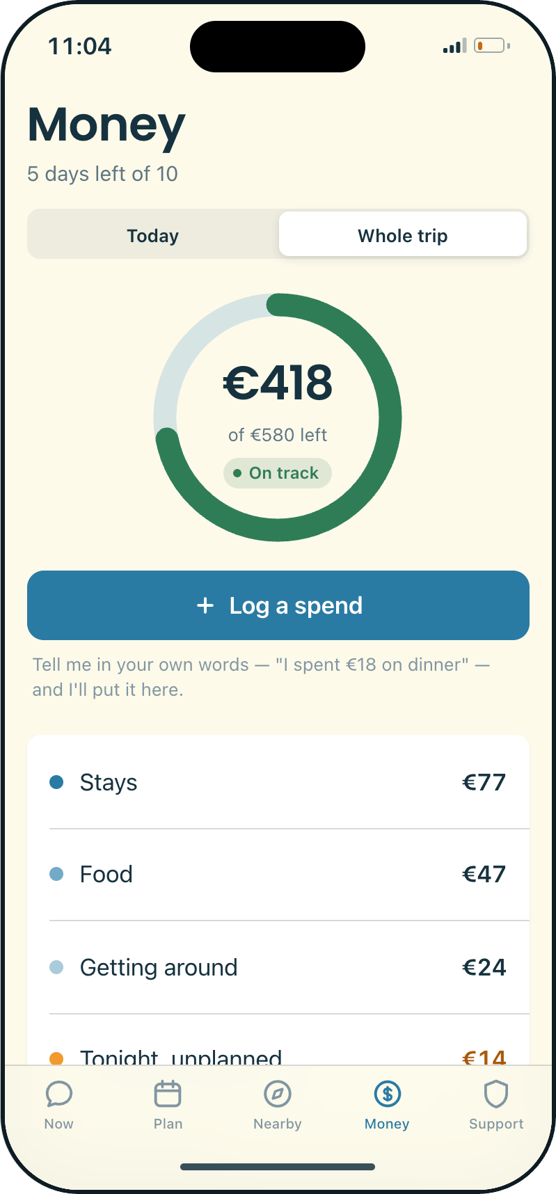
You log spending by telling Woby, like “I spent €18 on dinner”. It logs the spend and replies with what’s left. Mike gave up on his spreadsheet, so there’s no form to fill in here.
tab 05Support
The safety layer: a trusted contact, a one-tap “I’m okay” message, and “I need help now”. That button checks how urgent things are, then shows emergency numbers, insurance and your contact on one screen that works offline.
try the prototype
It’s live, so go ahead and miss a train
The app Claude Code built is deployed on Vercel. The Claude Design prototype is embedded on the right.
Go through onboarding, take the tour, then type “I spent €18 on dinner” and watch the Money tab update.
Warblers migrate thousands of miles on their own, so it felt right to make the guide one. Woby is animated (waving, strolling, singing) and has a face for each mood the app needs.
colour
Warm cream, deep teal and one blue accent. Green means saved, amber means tight but not wrong, and red is only for real emergencies.
type & patternsPoppinsPoppins for headings, the system font for body text. Real iOS patterns throughout: large titles that collapse, action sheets, alerts before anything destructive, and 44px minimum targets.
takeaways
Good design here meant clarity, calm and care
1
People need support, not just toolsReassurance and a feeling of company turned out to be the edge, more than any single feature.
2
AI speeds up the making, not the decidingBuilding with Claude meant I could test real behaviour within hours. The premise, the principles and the visual direction still had to come from me.
3
Designing states, not screensOffline, a tight budget and emergencies aren’t edge cases for this app. They’re what it’s for, so each one got its own designed state.
what I would do next
Where it’s still a prototype
Real location and emergency servicesRight now you describe the situation to the app. The app doesn’t sense it.
Finer privacy controlsWhat the trusted contact can see, and for exactly how long.
Testing the tone with real travellersWhether Woby comes across as calm or as patronising isn’t something I can decide alone.
Four cities are written in full. A fifth would show whether this scales, or whether the quality only comes from writing every city by hand.
Thank you for reading!
Reach out if you have any questions. I can share the design files and the handoff on request.